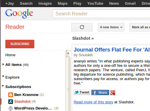
My wife complained about all of the extra stuff at the top of Google reader. You know, the links to all of the other Google products in the black bar, the humongously big “Search Reader” bar and Google logo. I had never really minded them before, but it does take up around 150 pixels before you get down to your actual content!
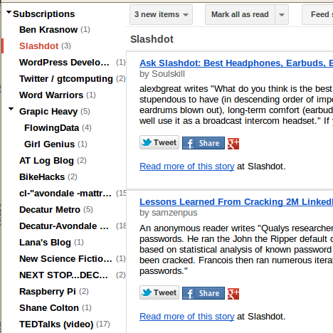
So I searched around and found out that other people also dislike all the extra clutter and have designed scripts that will allow you to give the Google User Interface a haircut. If you are using Mozilla firefox, you can install the Stylish plugin and then the Google Reader Absolutely Compact style to get the following effect:
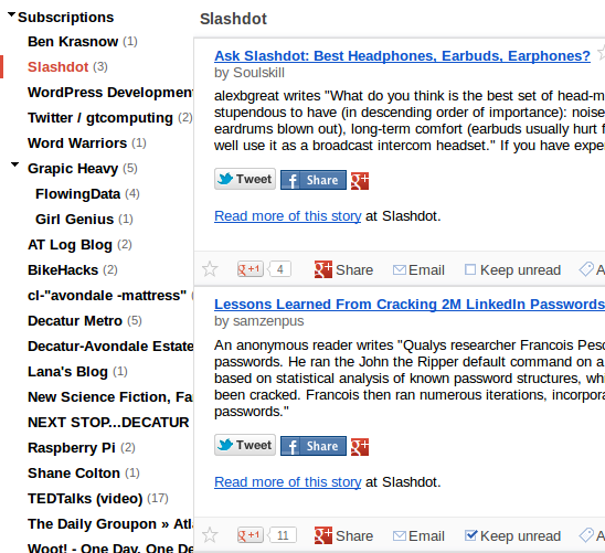
Of course, the Stylish modification is a “one size fits all” super compact view. I actually like having access to the “Entry Actions” (keep unread, Email link, Plus One, etc…), so I ended up using the Google Reader Absolutely Customizable script for the Greasemonkey add-on, as it allows you to fully customize which elements are shown/hidden from within the Google Reader GUI (click on the “Subscriptions” drop down menu, select “Customize…” at the bottom.). Here is my final view of Google Reader:
