Android version 12 has a lot of under the hood improvements, and I especially appreciate the privacy preserving features (green dot visual notifications when the camera or mic turn on, and finer grained permissions controls).
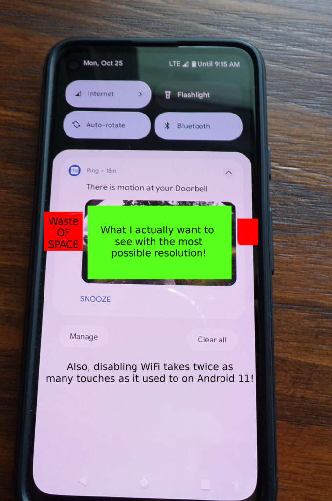
However, the new notifications system has traded visual appeal for utility. Specifically, the total screen area (width) used to display notifications is significantly narrower than in Android 11. The notifications are displayed with a white space frame around them, and even within that area, each notification is inside a rounded corner “bubble”, so that the actual content is only using 70% of the phone screen width. This is especially noticeable to me on notifications from the Ring app, which show a photo preview of what caused the motion alert to fire.
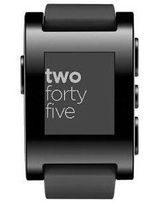
Also, they combined the “wifi” and “cellular data” quick action tiles into a single “Internet” one. So instead of two actions to enable or disable wifi (swipe down / click) I now must make four. (swipe down, click internet, click wifi, click ‘Done’). Also, I don’t appreciate the design of the two line clock on the lock screen, but whatever (no am/pm indicator, really?).


Google finally gave us a terrible explanation for this change, and explained that tapping your sim card will temporarily disable wifi (something nobody would ever find on their own):
https://www.xda-developers.com/google-android-12-internet-quick-settings-tile-reasoning/
Thanks for the tip, the command listed in that article to add the “wifi” tab back worked for me! (Of course, you have to know how to enable developer mode and use adb….)