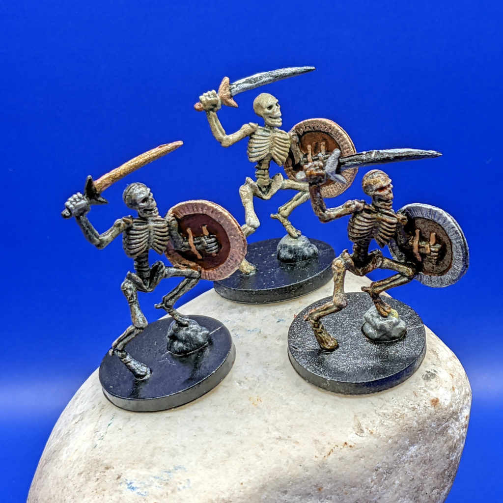
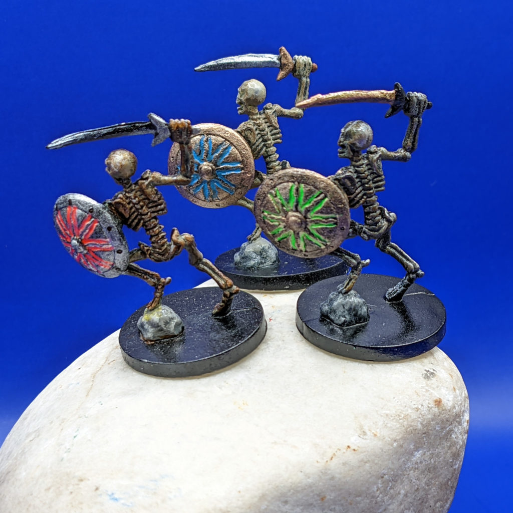
I painted the three Castle Ravenloft board game Skeletons with slightly different colors (mostly on the shields and swords, but the bones have different levels of tints on them as well) so that people could say things like “I want to aim at the one with the blue shield!”.
The general approach for bones is to do shades of gray/white first, then tint them with a bright yellow wash, followed by a transparent dark brown (burnt umber) wash. Variations in lightness and color can be made by the lightness/darkness of the base coats, and amount of washes you use.
If you want “light colored” bones, over-brush the entire skeleton with gray, leaving only the deepest recesses primed in black.
If you want “dark colored” bones, start off with a dark gray instead, over-brushing very lightly, leaving a lot of dark black areas, and then dry brush a light gray on for the highlights.
After you have the gray/white layer defining the values you want, you can color them to look like bones (as opposed to stone….). I like to start with a bright yellow wash to get the “bone” yellow effect. I do yellow first because it leaves pockets of yellow in deep recesses which you can then cover up with your 2nd dark brown wash. (It also helps if you use a dry brush to soak up excess yellow color that soaks into cracks right after you do the wash…the intention here is to color the bones, not brighten up the recesses…)
Also be careful to use a damp brush and wash off any excess yellow from non-bone areas. I got a little yellow on the rock he is standing on, which really should be shades of gray only…. Assuming you are going to hit the entire base with a layer of black later on, you don’t need to worry about excess colors washing the base.
As soon as the yellow wash is dry, I use a transparent burnt umber wash to give the bones that “fresh out of the ground” look. For this dark wash I DO intend to leave pools of dark pigment in all of the recesses, so I go relatively heavy on it and don’t try to soak up any excesses with a dry brush.
I’ve found that the combination of a bright yellow wash followed by a burnt umber wash gives a very realistic bone effect. You can add in a third wash of green in places if you want a moldy/mossy effect as well. You can use more or less burnt umber depending upon high dark/light you want the bones to look, but the overall value of your gray/white under-layer is what determines the “brightness” of your skeleton the most.
For example, my blue shield skeleton had the gray/white under-layer, while the other two (green/red shields) had a dark gray / gray under-layer. The difference between green-shield and red-shield is that I used full strength burnt umber for red-shield, and watered it down 50% for green-shield.
I’m a real fan of the Liquidtex Transparent Burnt Umber for washes…. The cadmium yellow hue might be a good substitute for the yellow wash I used (which was made by mixing my bright yellow CraftSmart acrylic paint with copious amounts of water)…but since each of the Liquidex colors cost around $9….I’m building up to that.
I haven’t gotten good enough to do Non-Metalic Metal (NMM) effects yet, so I just hit each sword with a different colored reflective metallic paint. I used Liquidtex Cerulean Blue Hue (which is an opaque color, not transparent like the Cadmium yellow hue or the transparent burnt umber, so pay close attention to the opaque, partially-opaque, or transparent key on the Liquitex acrylic ink color chart when choosing your colors….) for the shield inlay directly.
However, for the red and green shields, I purchased the Liquitex Fluorescent Red and Fluorescent Green which ARE transparent. This means I needed to use a base layer of Liquitex Titanium White (fully opaque) under them to make them Fluoresce like I wanted. The nice thing about using inks for recessed areas like this is that you can load up a long brush and then when you touch the tip of the brush inside the recess, surface tension will draw the ink throughout the recess, meaning it almost paints itself. (You have to be careful to not get too much ink on the brush, or to pull out before it overflows the recess….but excess ink can be wiped up or washed off when wet if you make a mistake.)
I hit the backs of the shields with a light brown, then used a black wash over it to highlight the texture in the sculpt. I used golden brown on the leather shield straps, and then a bronze, copper, or silver metallic paint for the shields themselves. 
